Corporate Design
- Logo Evolution
- Design System
- Campaign Concept
The Humboldt Forum will gradually open from December 2020 as a unique place of experience, learning and encounter in the heart of Berlin.
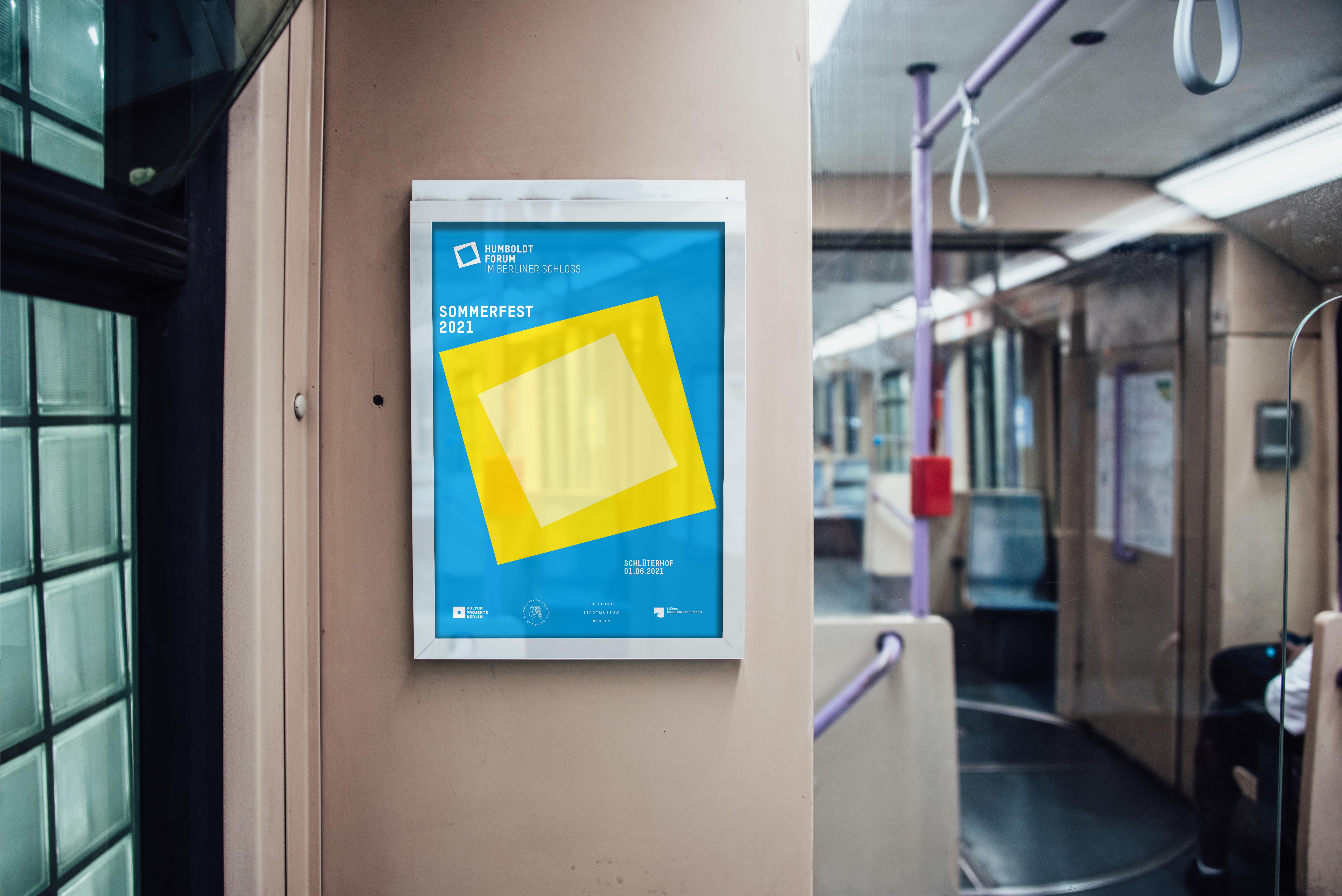
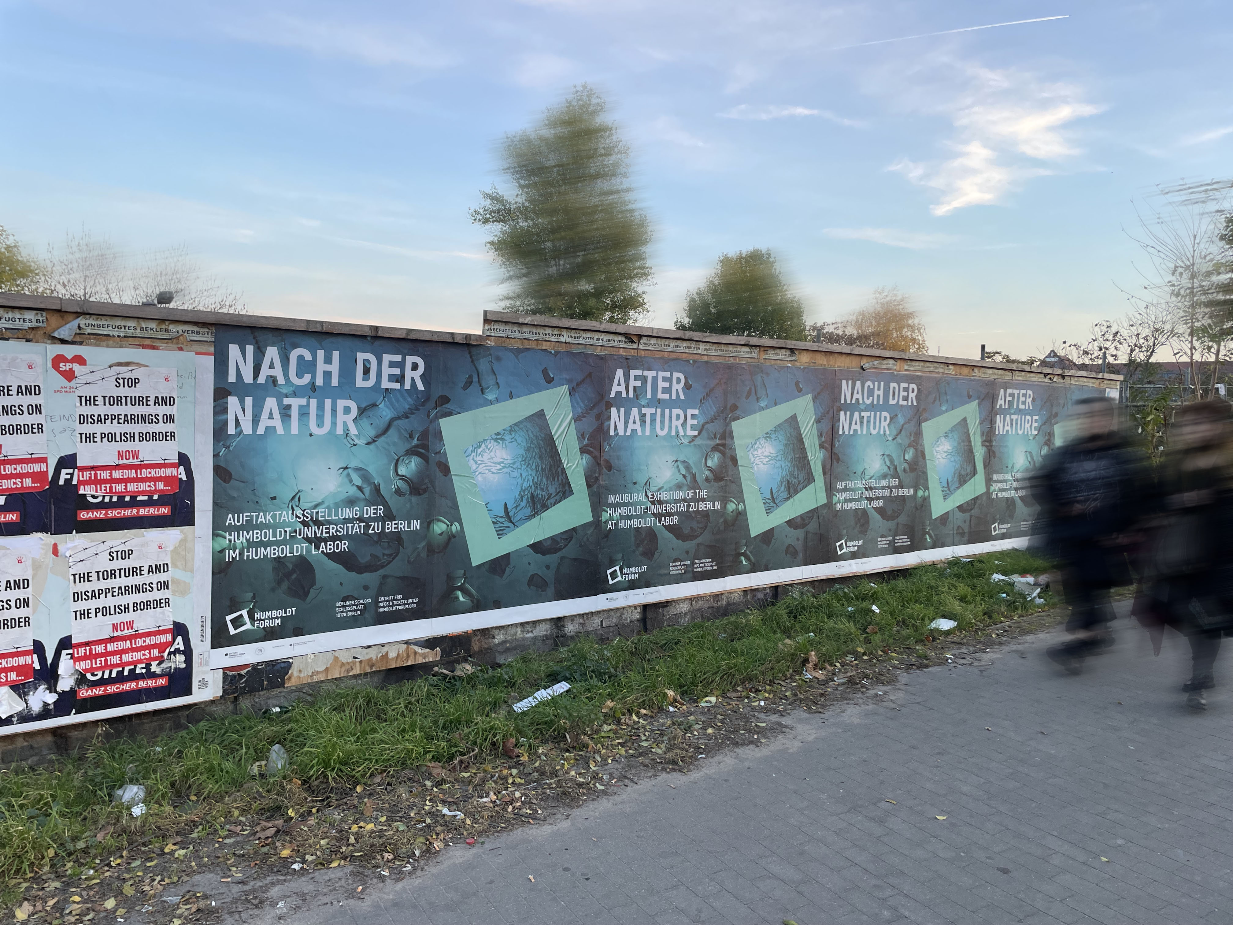
As this institution consists of four equal partners, the challenge was to find a way to present them all in the same way. Since the location, a renovated baroque palace in the center of Berlin, is itself still a highlight, we took the logo of the palace as the central key visual to embrace the four parts.
This museum is an interface between past, present and future, which is also reflected in the architecture. We translated this concept into our visual by using the logo with the greatest possible branding that reflects past and present to represent old and new.
In addition, the two basic shapes of the logo are the basis for other designs in web and print;
They are easy to apply and can be placed anywhere within static templates. This helps in highlighting headlines, quotes, and images, as well as organizing elements to maintain a good amount of white space in both print and web.
To ensure enough leeway as far as future exhibitions are concerned, the basic colors of the system are black and white, any further color schemes are determined by exhibits and imagery. This subtly continues the principle of juxtaposition.
A similar principle is found in the typography; the house font consisting of a simple grotesque in combination with decorative fonts are chosen to match the individual themes of the exhibitions.
︎︎︎ Agency: Scholz & Friends
︎︎︎ Role: Senior Designer (Lead)