RWE REDESIGN RWE REDESIGN
Corporate Design
- Logo Redesign
- Design System
- Custom Typeface
- Custom Iconset
- Campaign Concept
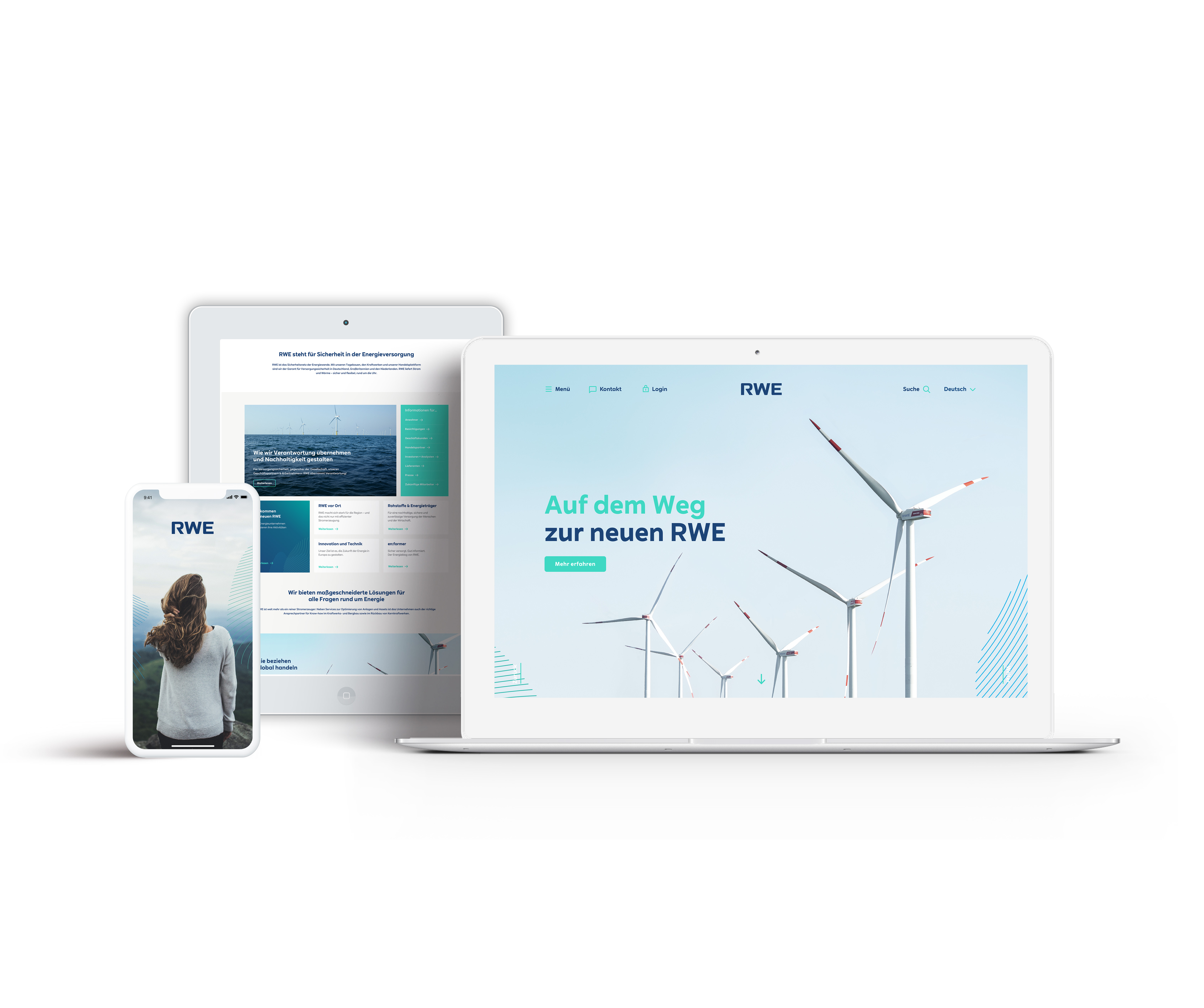
One of the biggest projects at Scholz & Friends Berlin was the redesign of the "new RWE", a large energy provider from Germany that has become one of the leading companies in the field of renewable energy in Europe.
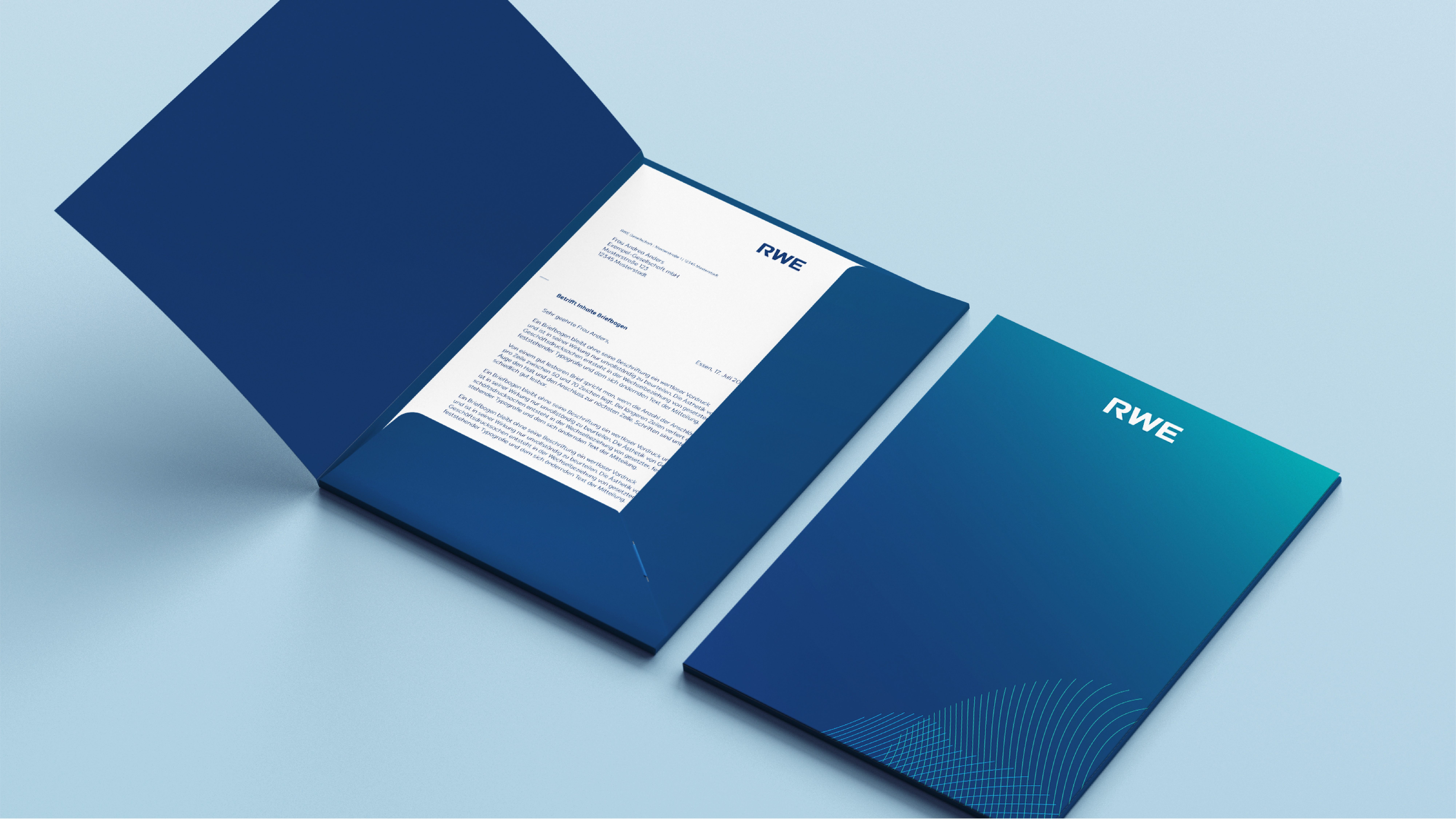
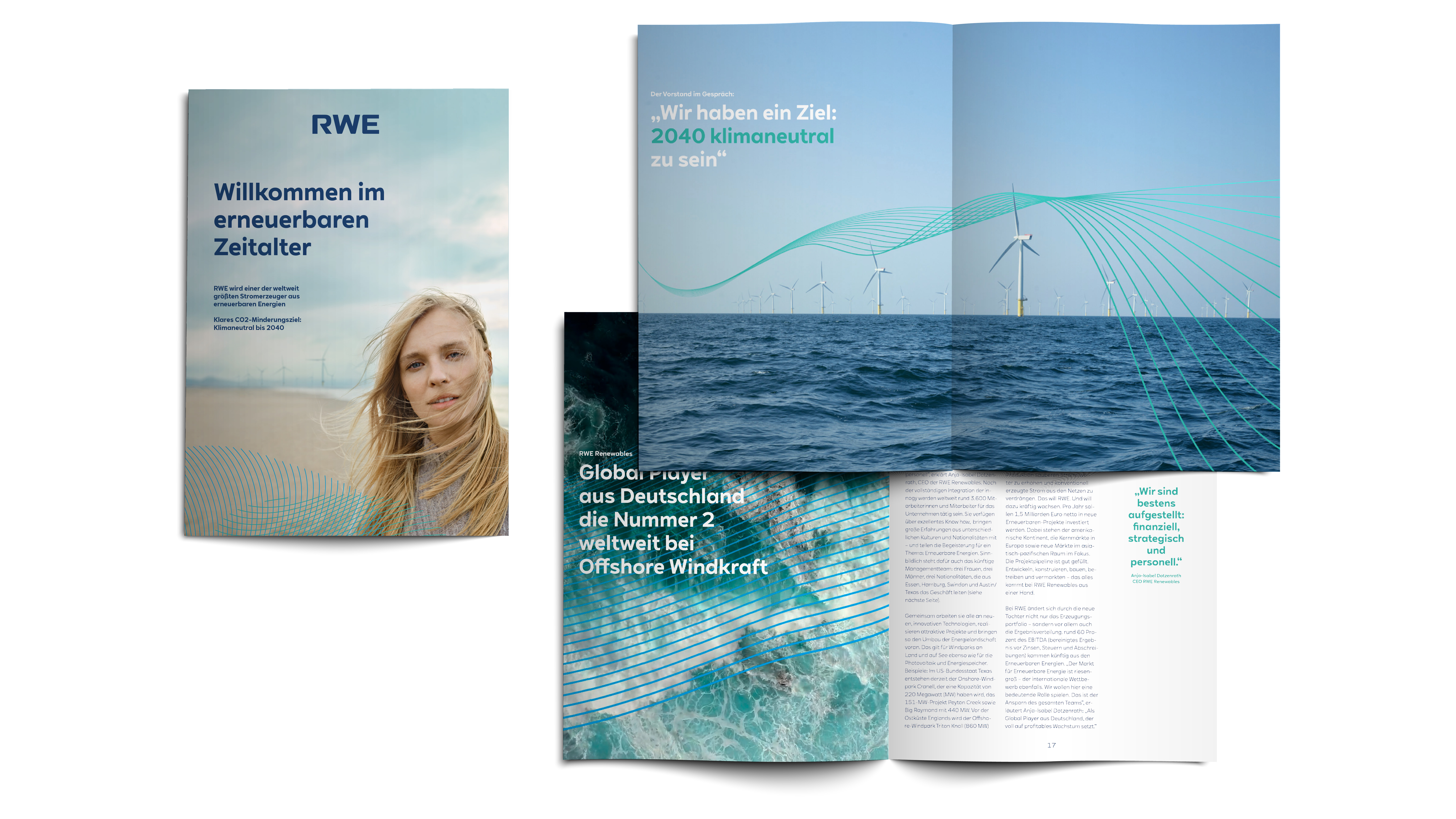
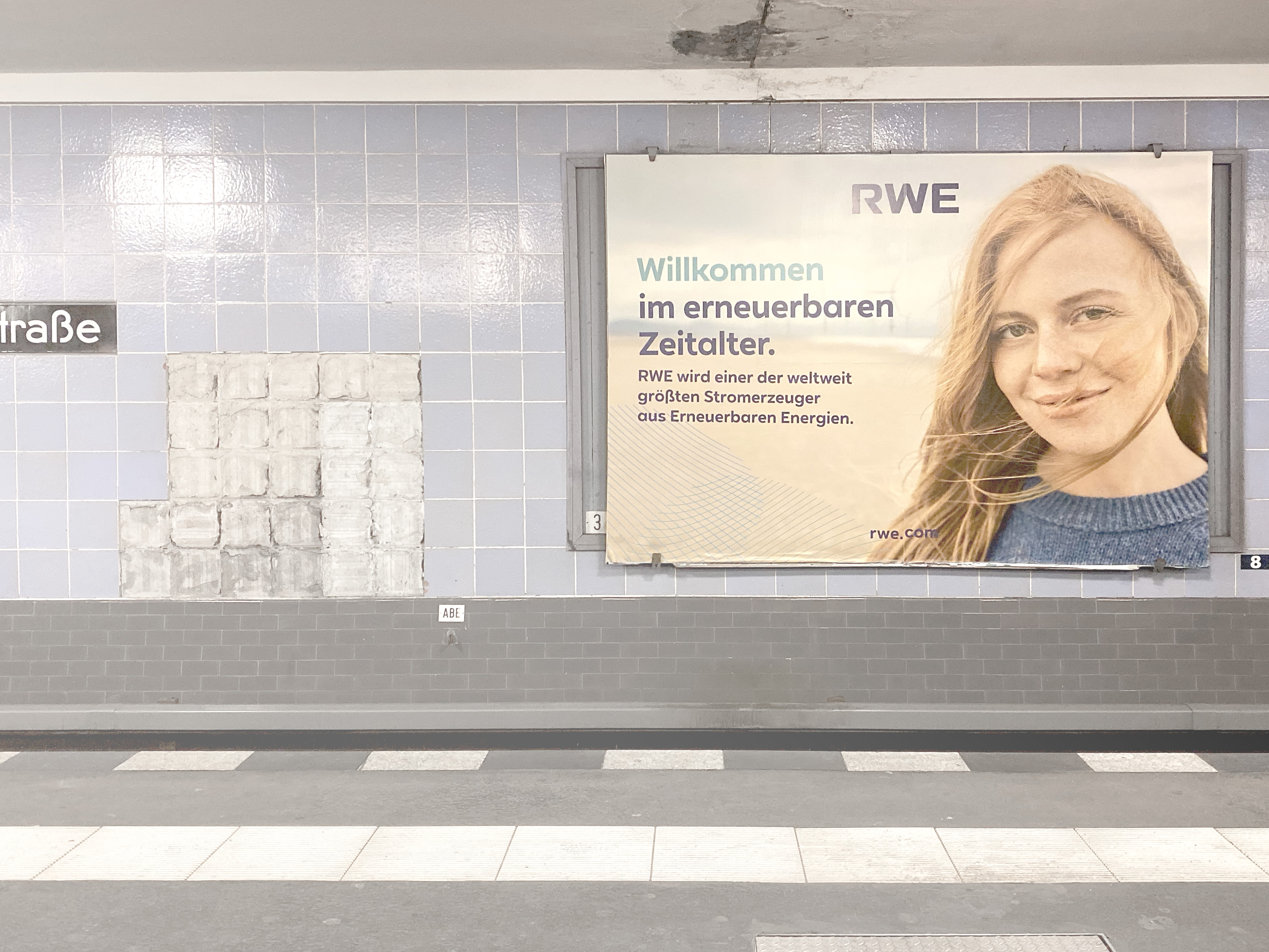
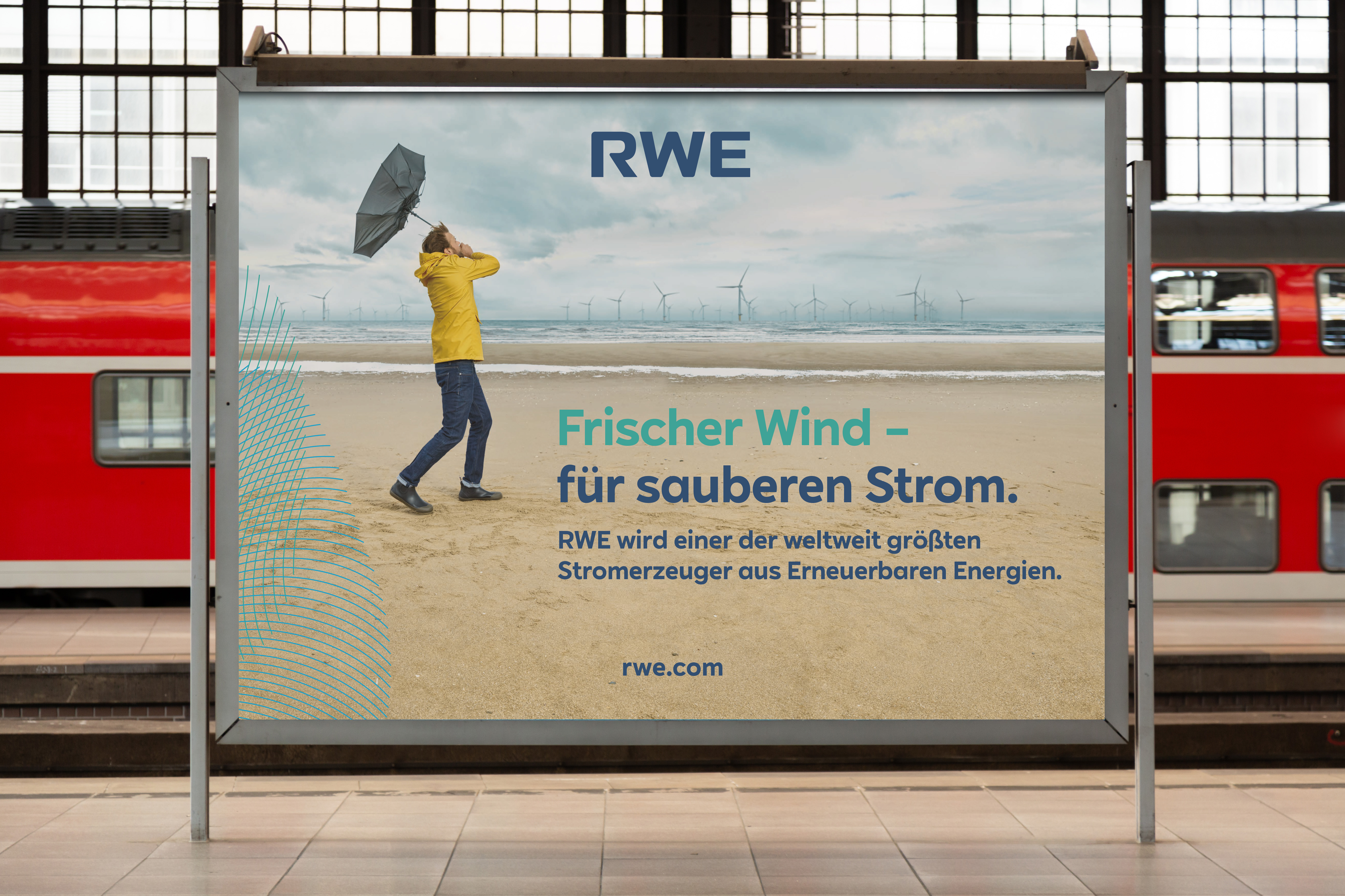
We were given the task of putting the company's image in an appropriate light. This included redesigning the logo, redefining the brand colors, a new custom font, art direction for the visuals, letterheads, even icons and signage.
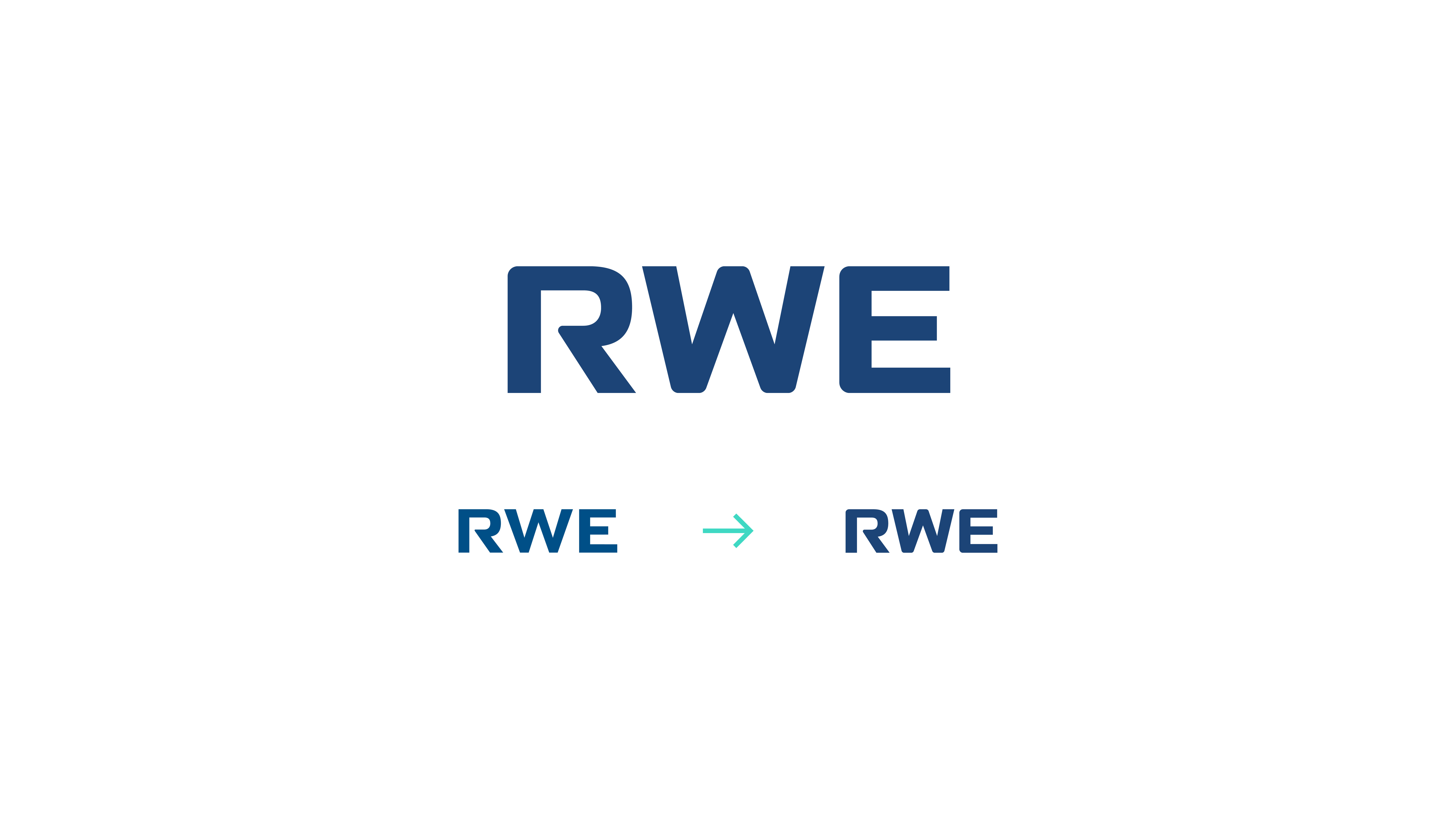
The logo was redesigned by keeping the old letter R but reflecting the brand's new font. In addition, the corners of the logo were softened so that it is now easier to read on small devices.
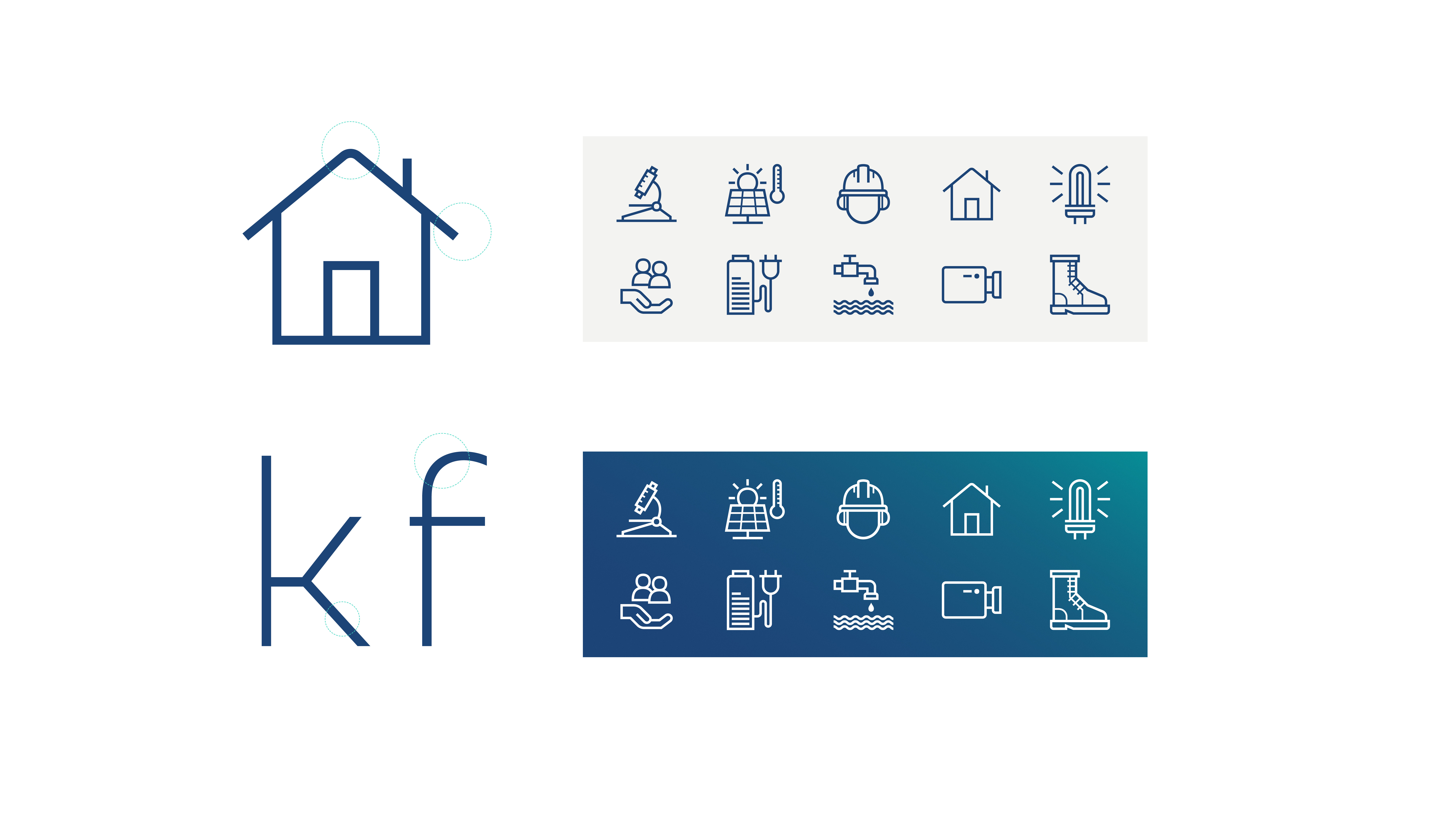
"RWE SANS", a modern typeface consisting of geometric shapes and clean cuts. The typeface is also reflected in the new icon set. The main graphic elements are inspired by topographic lines and the graphic jargon used to visualize weather conditions. These so-called energy fields form the transition between the graphic world and the images, emphasizing both movement and power.
The brand colors have been extended to preserve the heritage, but also to show the transition to more natural energies, as well as a brighter appearance on digital screens.
︎︎︎ Agency: Scholz & Friends
︎︎︎ Role: Senior Designer / Art Director
