STUDIO SCHANZ STUDIO SCHANZ
Corporate Design
- Logo Design
- Color Concept
- Layout Concept
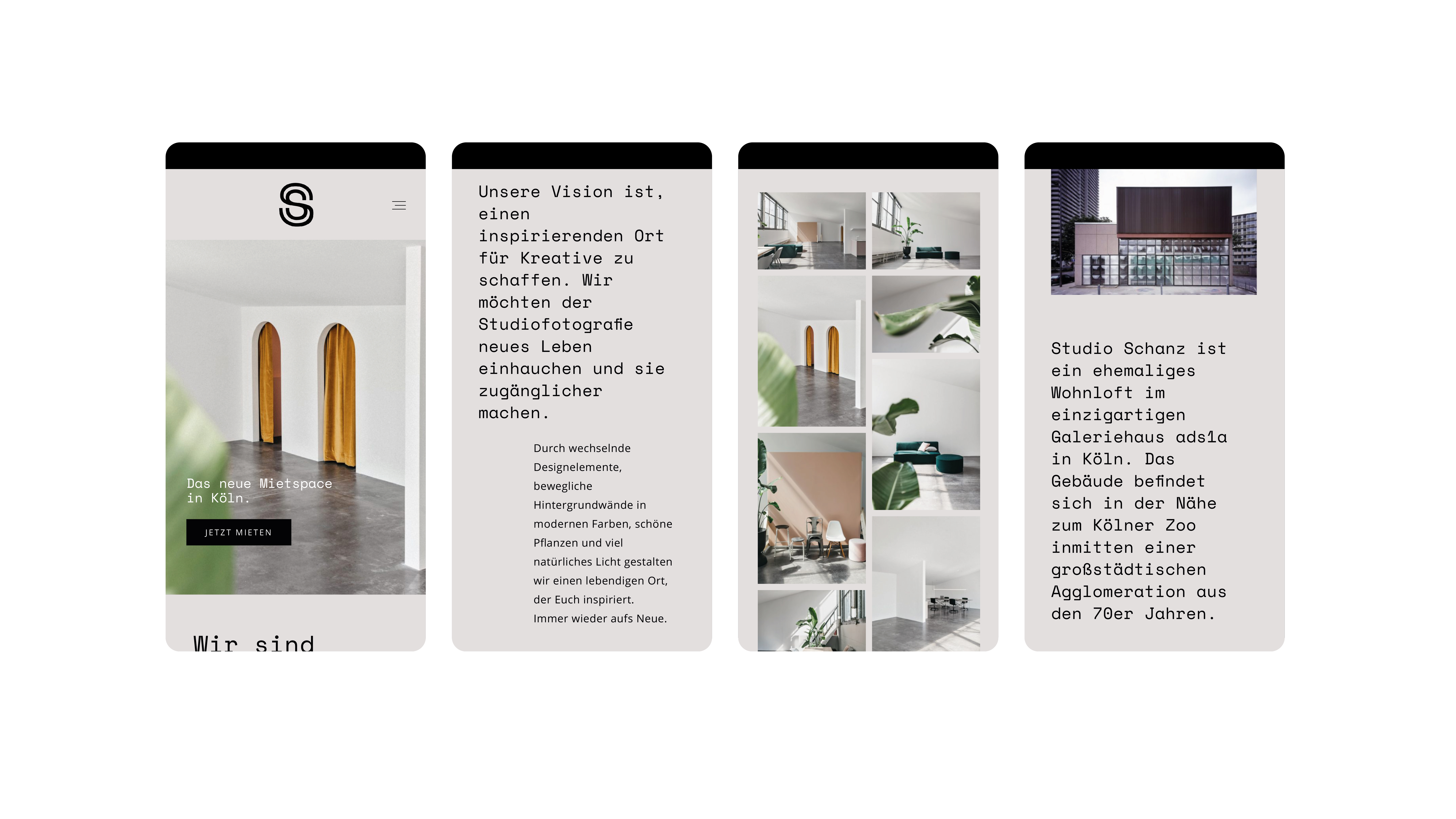
I was asked to design a branding for a new rental photo studio in Cologne called studio schanz; this name simply comes from its location "an der Schanz 1a".
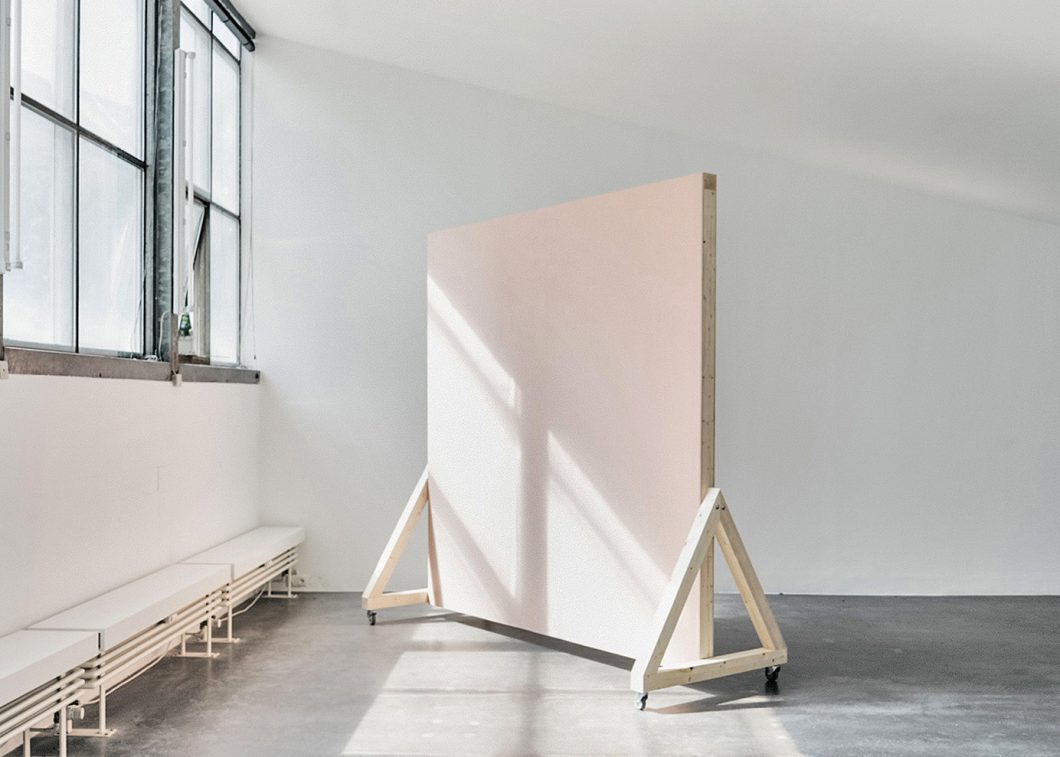
The airy space captivates with its large industrial windows that bathe the empty interior in dazzling hues.
The color palette is derived from the architecture and interior; Gray concrete and white walls form the primary colors and are complemented by dark greens from plants standing around. A pastel, light purple cites the furniture.
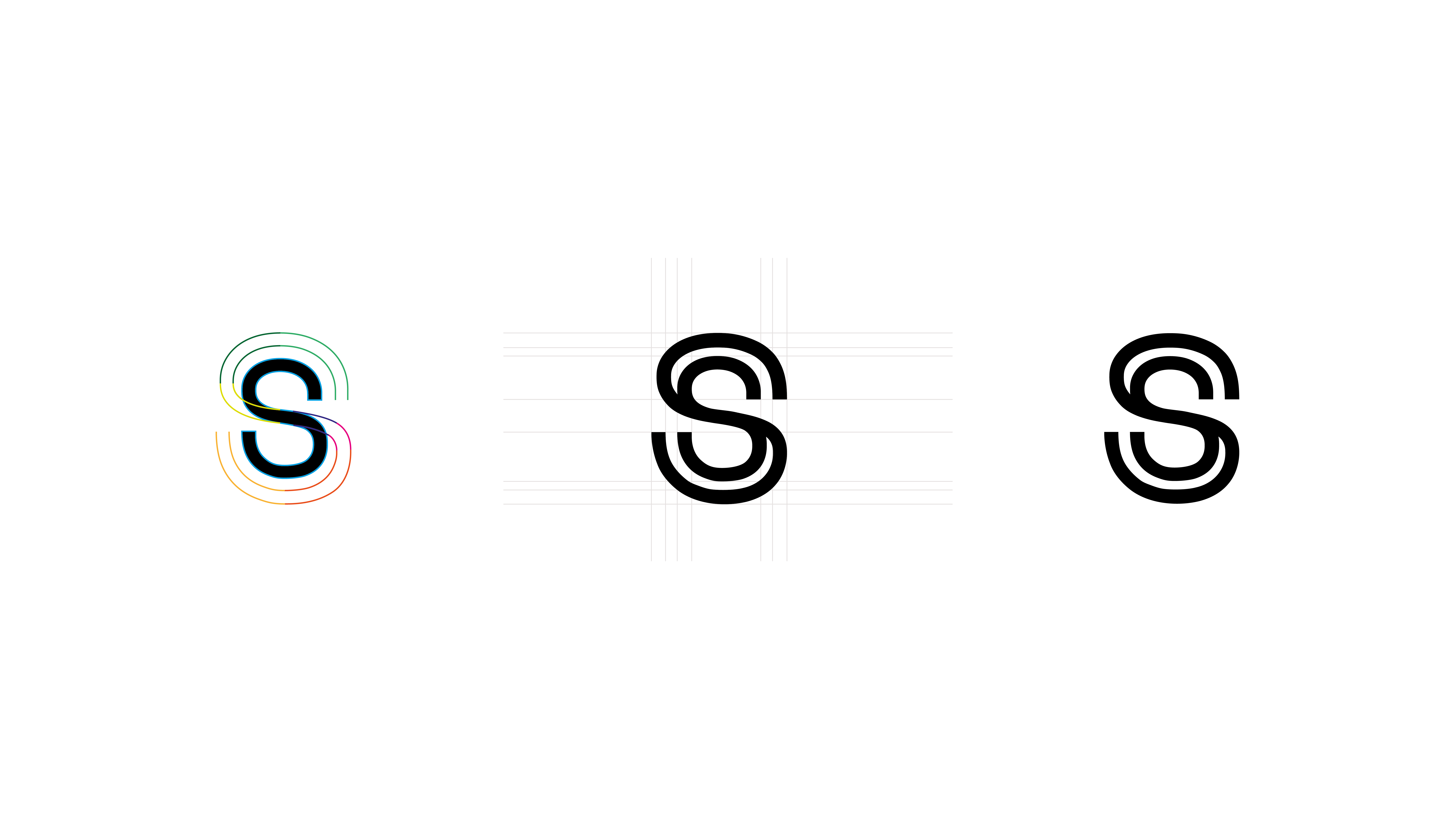
The remaining assets, then, were the basic typography and logo. For the website's CMS, the simple but distinctive font "Space Mono" is used. It forms the basis for the headlines and the figurative mark was derived from it to be part of the overall look.
Also, the entire CD was to be shared on social media, so it was obvious to start with the smallest applications;
For this reason, the wordmark was reduced to initials and optimized for screens and smallest touchpoints.
︎︎︎ Agency: Private Project
︎︎︎ Role: Senior Designer / Art Director


