The Humboldt Forum opened gradually from December 2020 as a new cultural institution in the center of Berlin. Formed by four equal partners, the primary challenge was to develop a visual system that represents all parties consistently while allowing for differentiation.
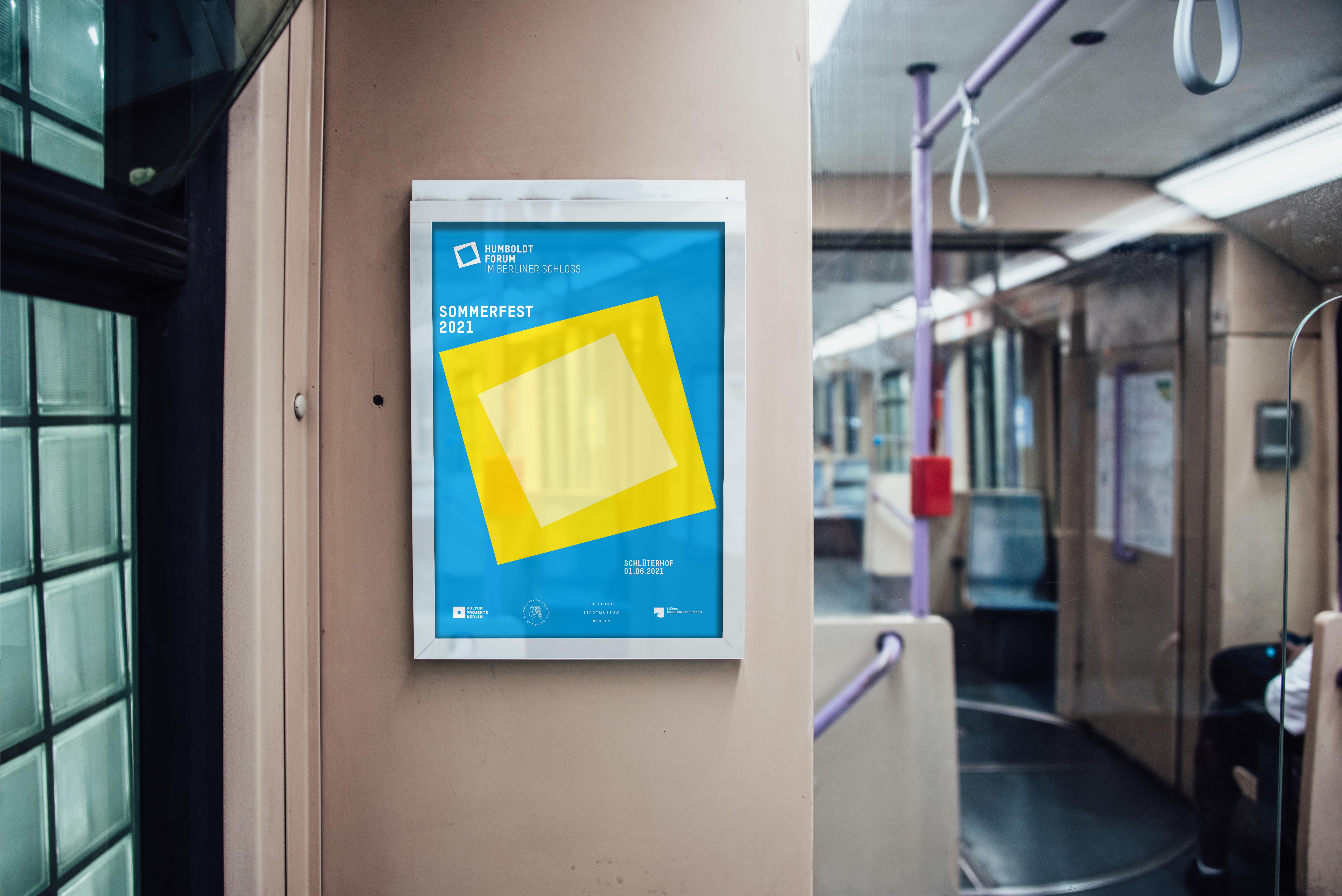
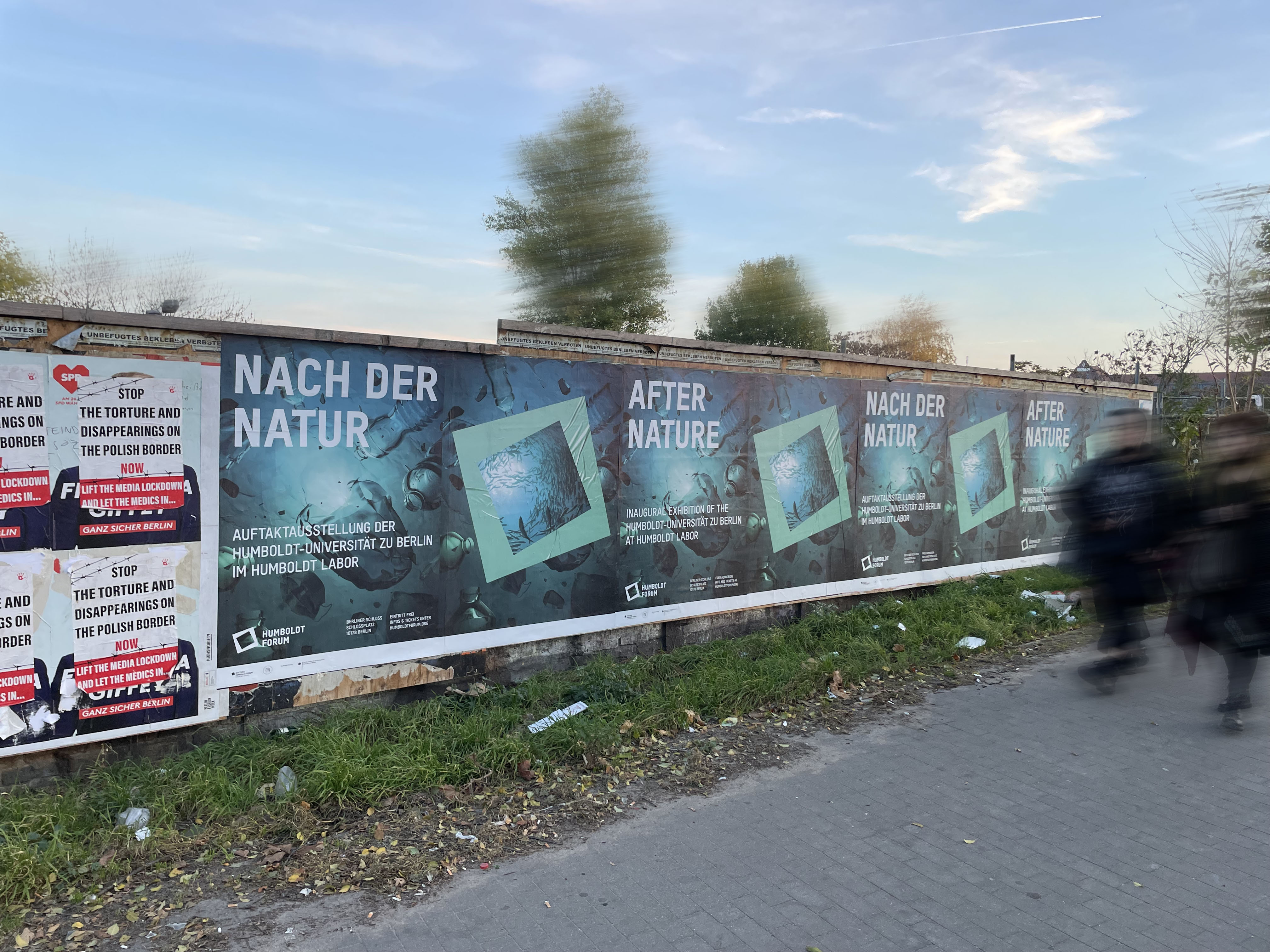
The reconstructed baroque palace served as a key reference. Its logo was defined as the central key visual, functioning as a unifying element across all partners and anchoring the identity in its architectural context.
The visual system reflects the institution’s position between historical heritage and contemporary cultural practice. This tension is translated into a clear design language through deliberate contrast and reduction.
Two geometric elements derived from the logo form the basis of the system across print and digital applications. Their flexible use enables clear hierarchy, structured layouts, and controlled white space across a wide range of content.
To ensure long-term flexibility, the core palette is limited to black and white, with additional colors introduced exclusively through exhibition-specific imagery. Typography follows the same logic: a neutral grotesque forms the foundation, complemented by display typefaces tailored to individual exhibition themes.
Client: Humboldt Forum Berlin
Corporate Design
Corporate Design
- Logo Evolution
- Design System
- Campaign Concept