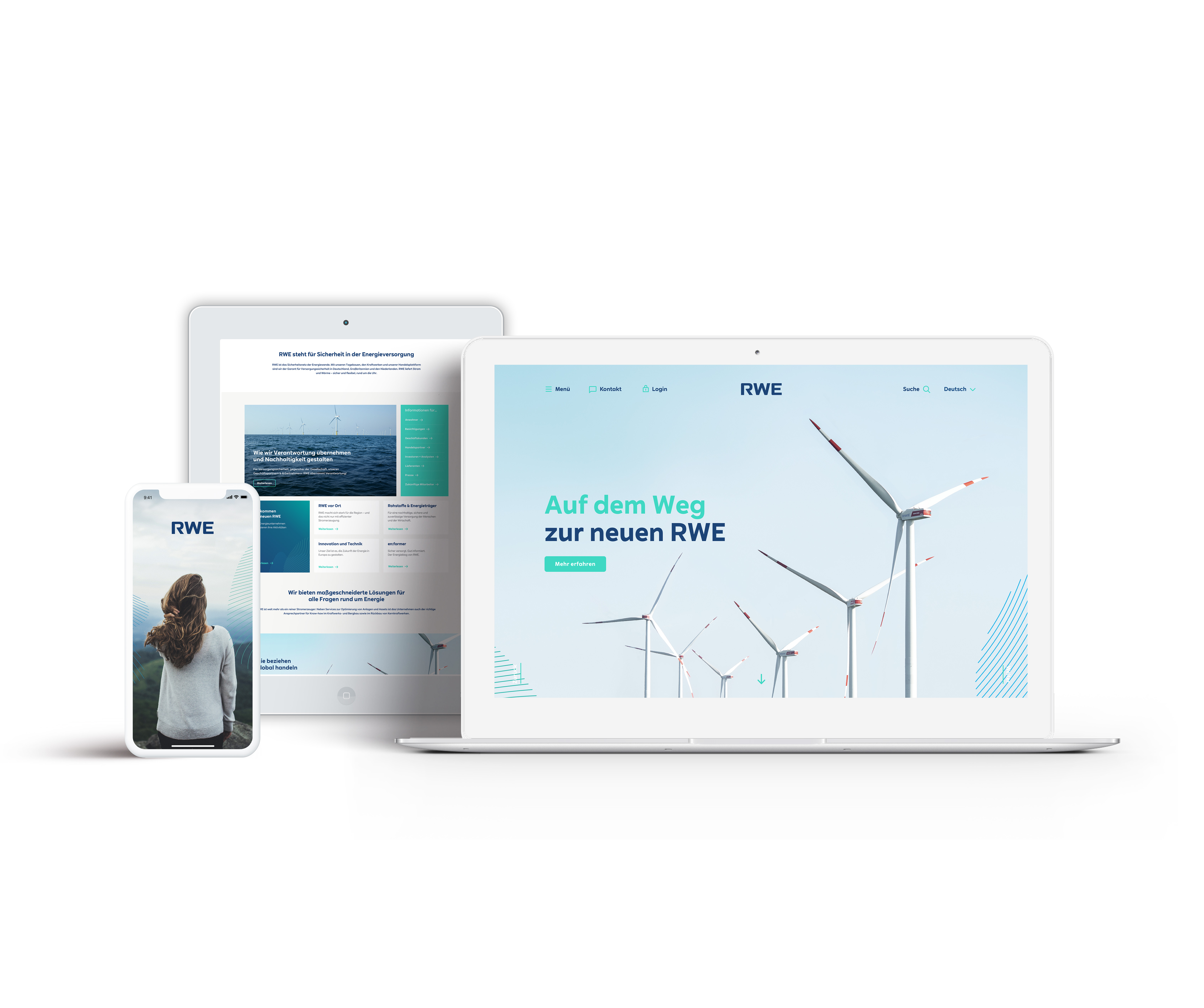
One of the largest projects at Scholz & Friends Berlin was the redesign of the “new RWE,” a German energy provider that has since become one of Europe’s leading companies in the field of renewable energy.
The task was to reposition the brand visually and reflect this transformation across all touchpoints. This included a redesigned logo, an expanded color palette, a custom typeface, as well as art direction for imagery, stationery, icons, and signage.
The logo redesign retained the existing letter “R” while adapting it to the new typeface. Softened corners improved legibility, particularly at smaller sizes and on digital devices.
“RWE Sans,” a contemporary typeface built on geometric forms and precise cuts, became the foundation of the visual identity and informed the accompanying icon set. Additional graphic elements were inspired by topographic lines and visual languages used to depict weather phenomena. These so-called energy fields bridge typography and imagery, emphasizing both movement and power.
The brand colors were expanded to preserve RWE’s heritage while signaling its transition toward renewable energy and enabling a brighter, more flexible appearance across digital applications.
Client: RWE
Corporate Design
Corporate Design
- Logo Redesign
- Design System
- Custom Typeface
- Custom Iconset
- Campaign Concept