Branding for a rental photo studio in Cologne.
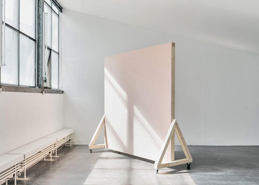
The identity is derived directly from the architectural space: industrial windows, raw concrete surfaces, and a restrained interior. The color palette translates these qualities into a reduced system of grays and whites, complemented by muted green accents and a soft pastel reference drawn from the furniture.
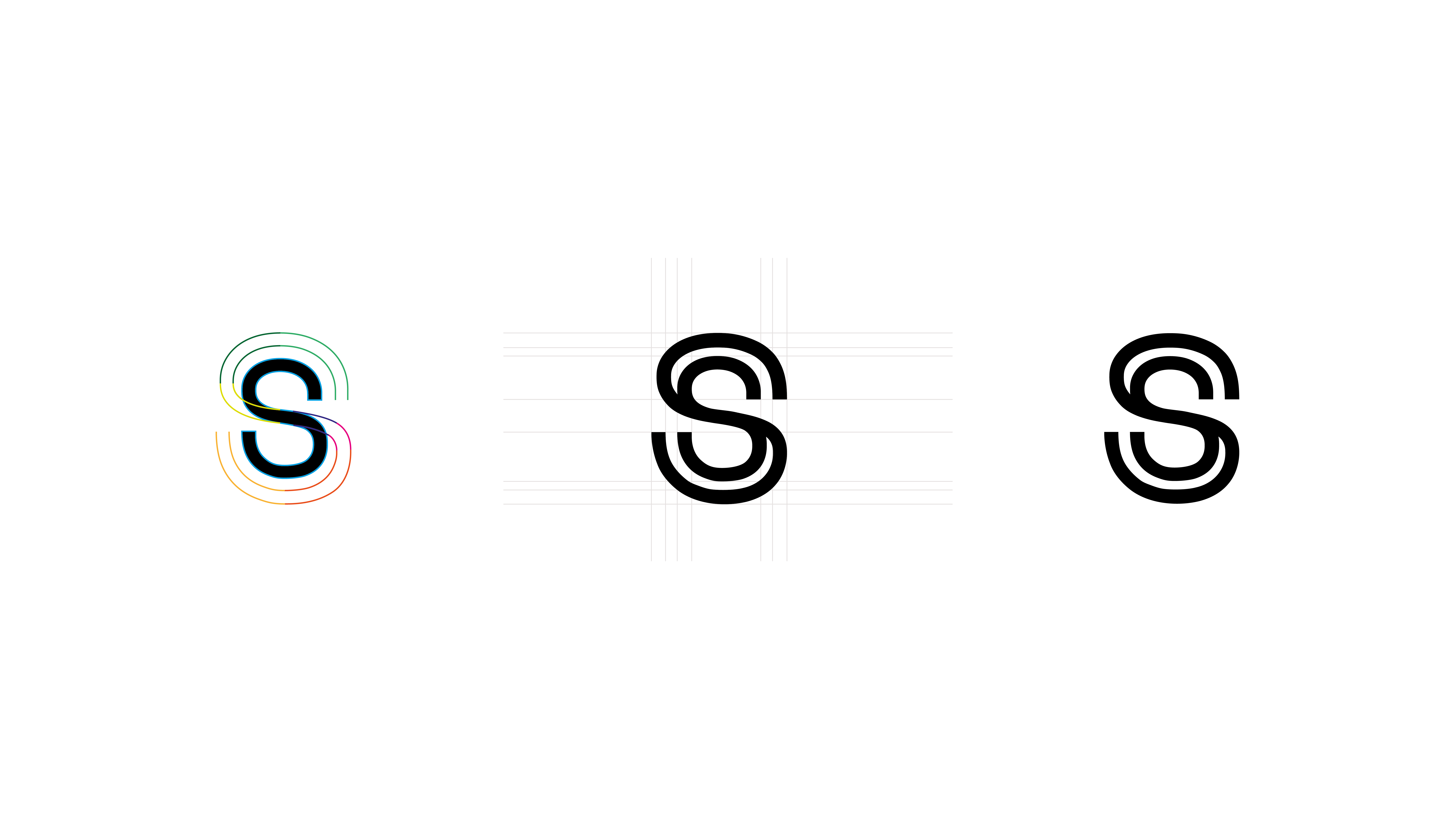
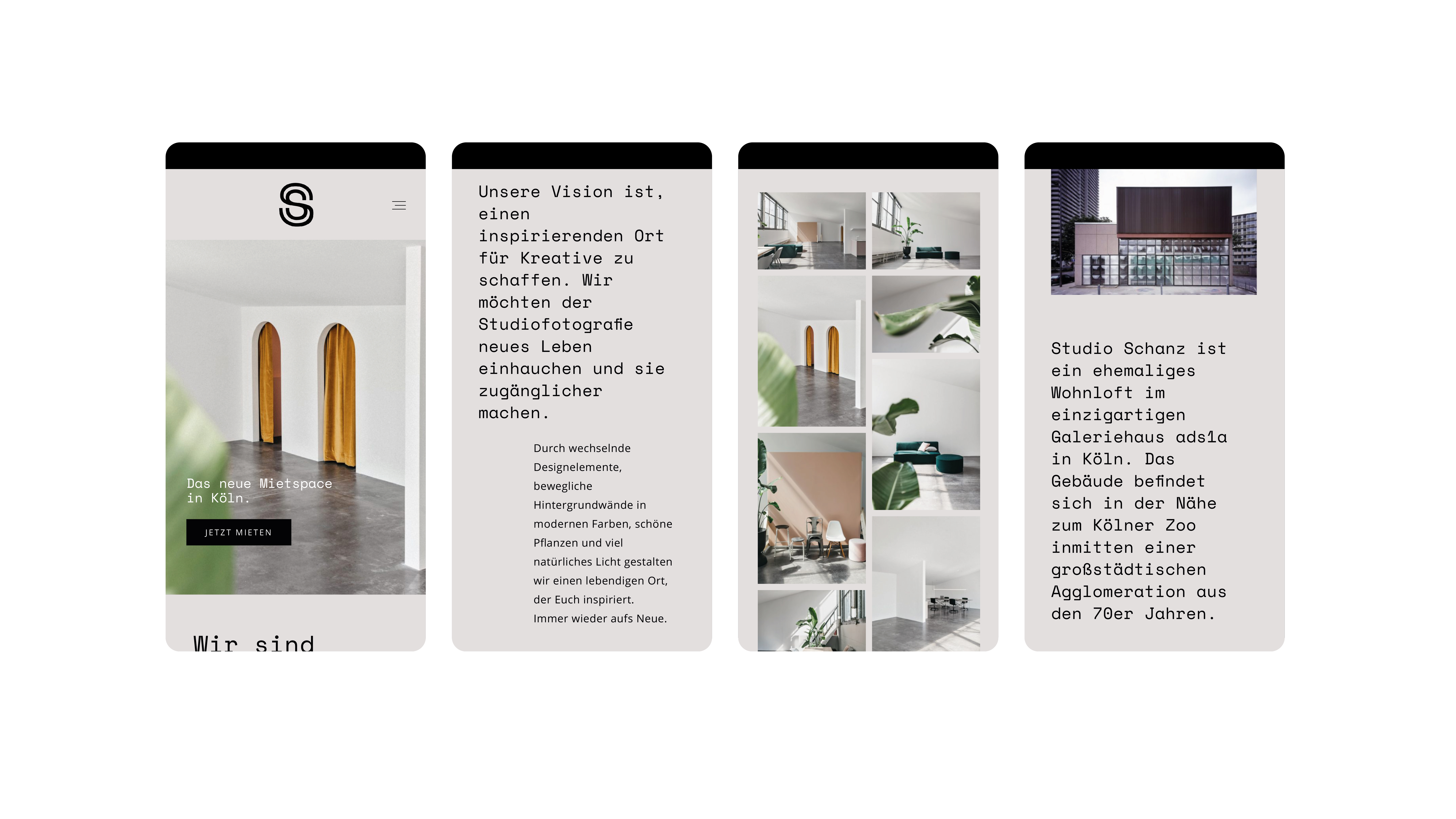
Typography and logo were developed as a minimal, flexible system optimized for digital use and social media. A reduced wordmark and clear typographic hierarchy ensure recognizability across small-scale applications and screen-based touchpoints.
Client: Studio Schanz
Branding
Branding
- Logo Design
- Color Concept
- Layout Concept


